Spelman College & AUC
The Atlanta University Center (AUC) is a consortium of four Historically Black Colleges and Universities (HBCU)—Clark Atlanta University, Morehouse College, Morehouse School of Medicine, and Spelman College.
I was able to take this project on start to finish creating a wordmark, site, collateral and a brand voice for all three schools in the union. It was a special project to help bring attention to art programs in Atlanta and helped to further educational opportunities in all three schools.
Work
Direction, wordmark, branding, collateral, design
Year
2019
Creating a mark
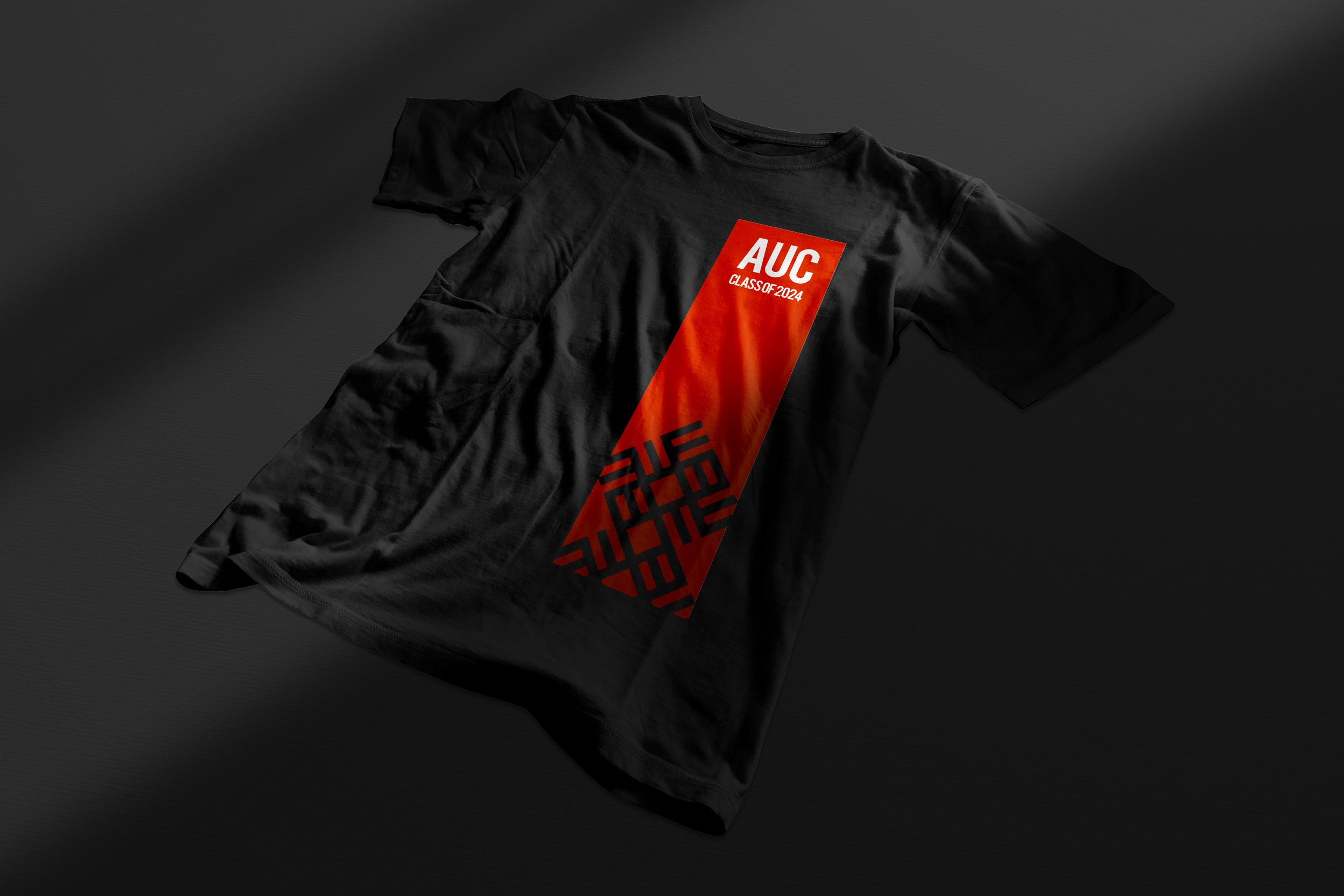
We created a brand identity that calls back to traditional African art using the Adinkra symbol for “knowledge and learning” to inspire the logo. The three colors are used in the brand reflect each university respectively and allows the everyone to use the logo while keeping it their own.
Making a bold statement
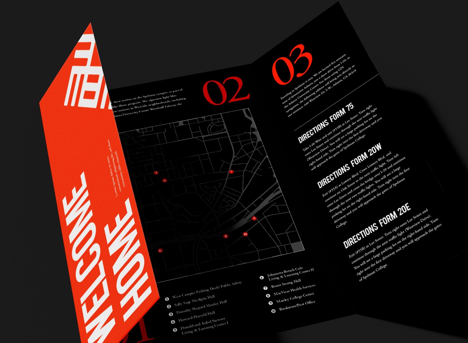
We stand out from the crowd. Using the mark as a bold statement piece was important to show our pride and introduce ourselves as a collaborative that isn’t going anywhere. Not only does this piece speak for itself but it breaks the rules and allows us to do our own thing that extends into everything we do. It’s important to stand out in print collateral as well and do things differently than all other schools around.
Creating a space for all
In addition to creating the brand direction and wordmark I was tasked with creating a hub of sorts for all three HBCU creative schools. Thinking through this I wanted to give each school it’s own way of standing out on their own while keeping the unity created by the AUC. As I built the site I used the “+” from the word mark as a design element as cohesion but also color coded each school with their current branding. Each time we highlight a photo or alum the tags and elements are accompanied by their own colors around each.


